City of Carpinteria
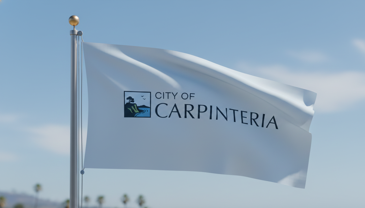
The City of Carpinteria partnered with Studio Seaside and Two Trumpets Communications to reimagine a cohesive, modern brand identity that could serve a diverse community while standing the test of time. The goal was to create a clean, versatile logo system that reflects Carpinteria’s natural beauty and civic pride, while working seamlessly across departments, languages, and applications.
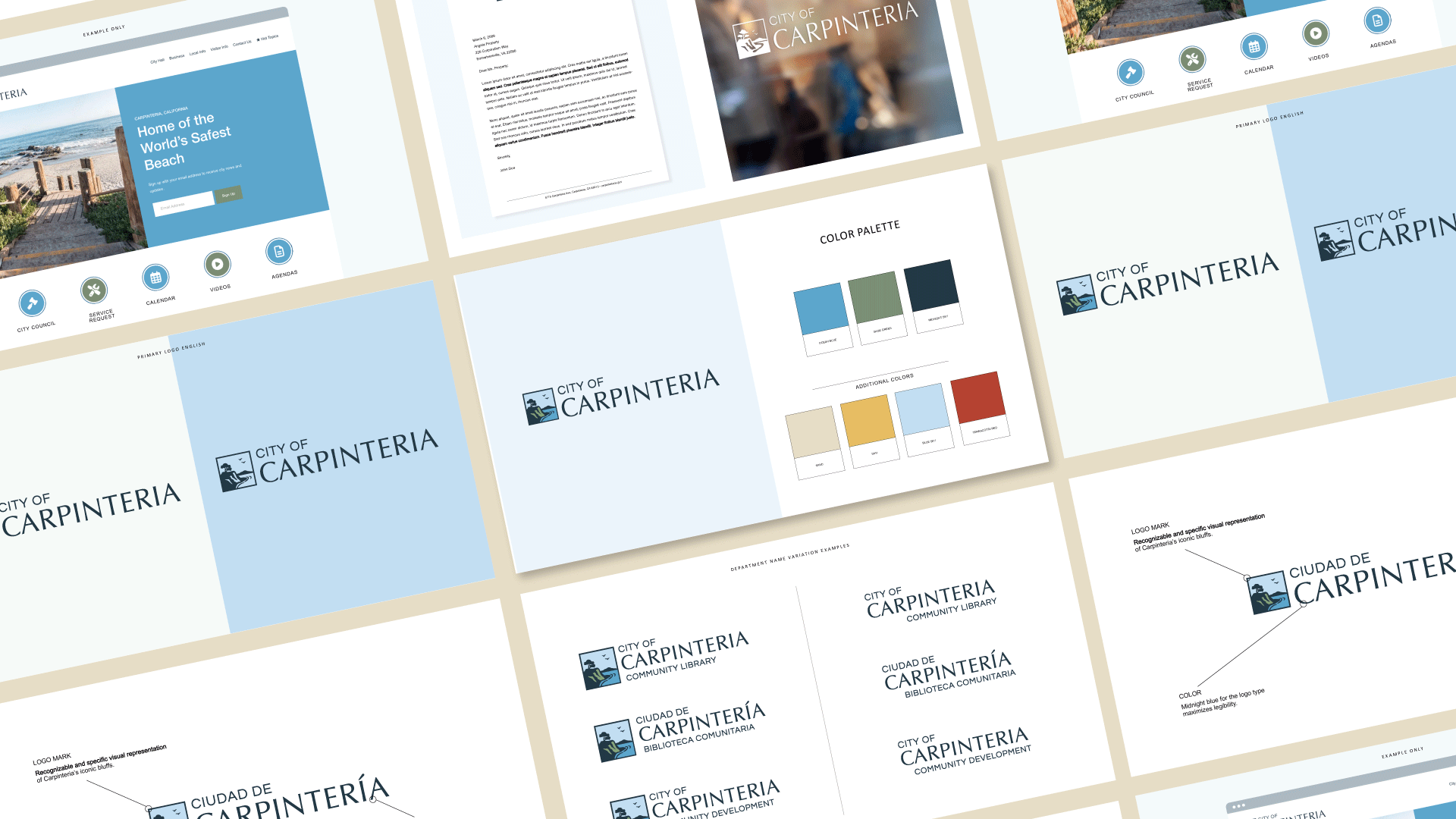
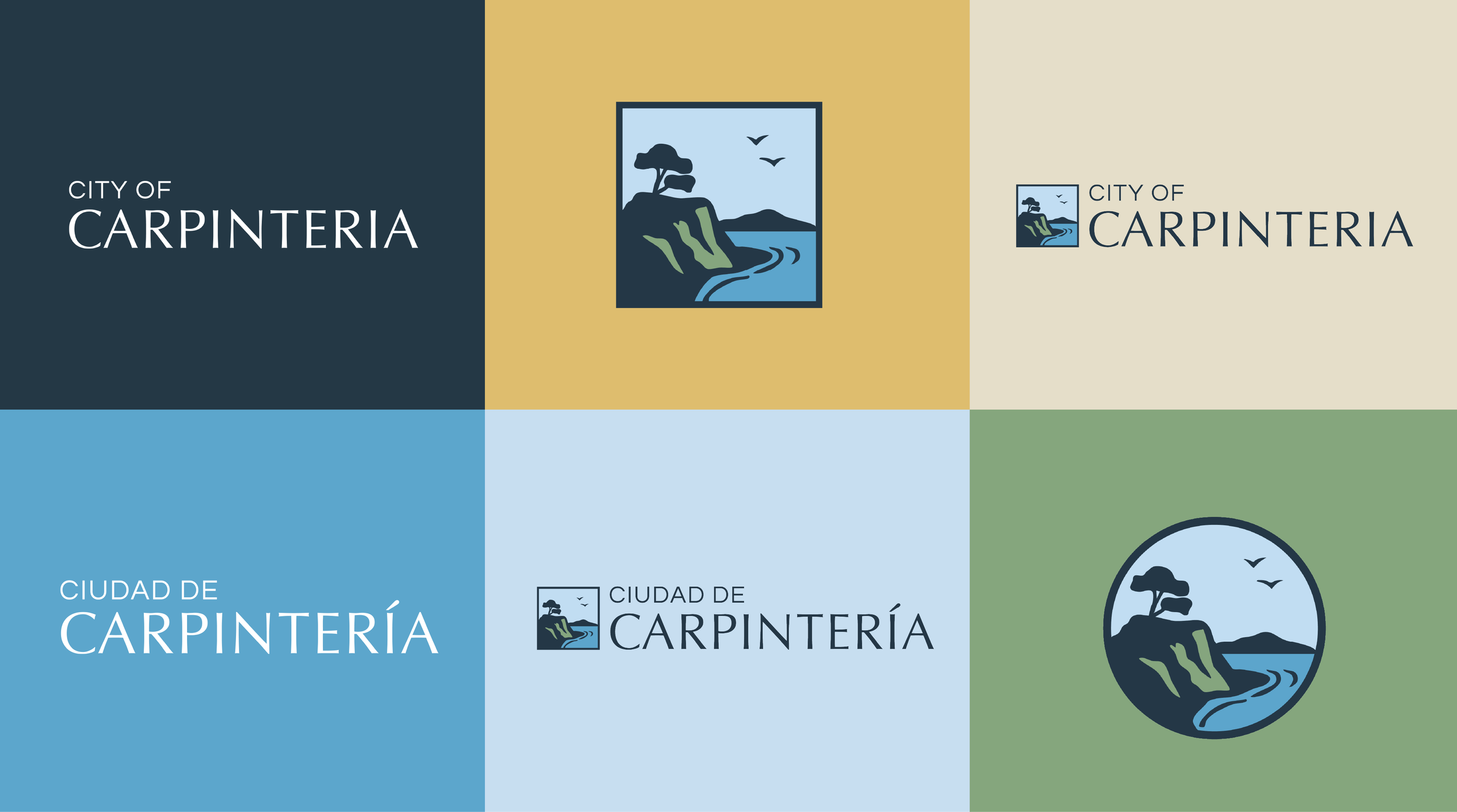
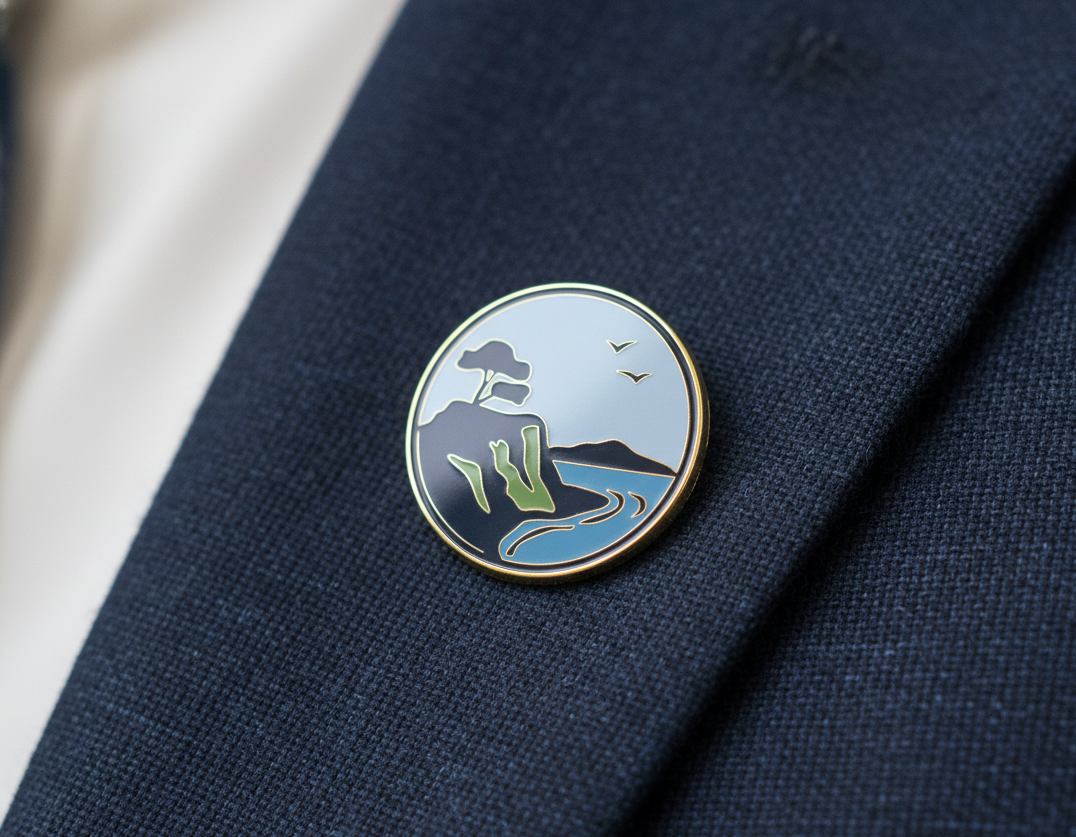
The final identity balances heritage and simplicity, featuring a refined logotype and a custom logo mark inspired by the city’s iconic coastal bluffs and ocean horizon. Designed for both English and Spanish use, the system includes adaptable department variations, a flexible color palette rooted in coastal and natural tones, and thoughtful typography that feels professional yet approachable. The result is a unified visual language that supports city staff internally, strengthens public-facing communications, and authentically represents the residents of Carpinteria.
Scope of Work:
Brand logos marks in English and Spanish
Color palette