How to Optimize Your Squarespace Site for Mobile
Note: This blog post contains affiliate links, however, I only recommend brands that I use and love.
In today’s world it is getting increasingly more common to look up businesses directly from your mobile phone. If you look at the analytics on websites versus mobile view, it’s almost split 50/50. If your website looks amazing on the desktop, but takes pinching or zooming to view from your phone, then you are doing yourself a massive disservice. Not only does this turn people away from your website but also hurts your SEO making you lose a lot of potential website traffic. So long story short, if you have not optimized your mobile view, you are losing money.
Thankfully, Squarespace automatically fits to every screen from desktop to iPad and mobile with every update and design that you add with their responsive design update, but it does not always look the way you want. Sometimes the image comes before or after text when it should line up beside and it throws off your whole design. While you do not have to worry about your mobile site being unreadable, in order to fully optimize it you want it to look professional and that takes a little more effort.
Here are a few ways to check, update and get the most out of your mobile layout through Squarespace:
Device View
To view what your current website design will look like on multiple different devices, Squarespace has the handy device view. Not only will this let you look at your Mobile website but also iPad and a few other options. Here you can look at what Squarespace has compiled with your website and make adjustments as needed. A few common things to look out for are awkward gaps, spacing issues and cropped images. I would also recommend taking a look at your website straight from your smartphone to double-check that what you are seeing via Squarespace is coming through on your phone!

Compress your file sizes
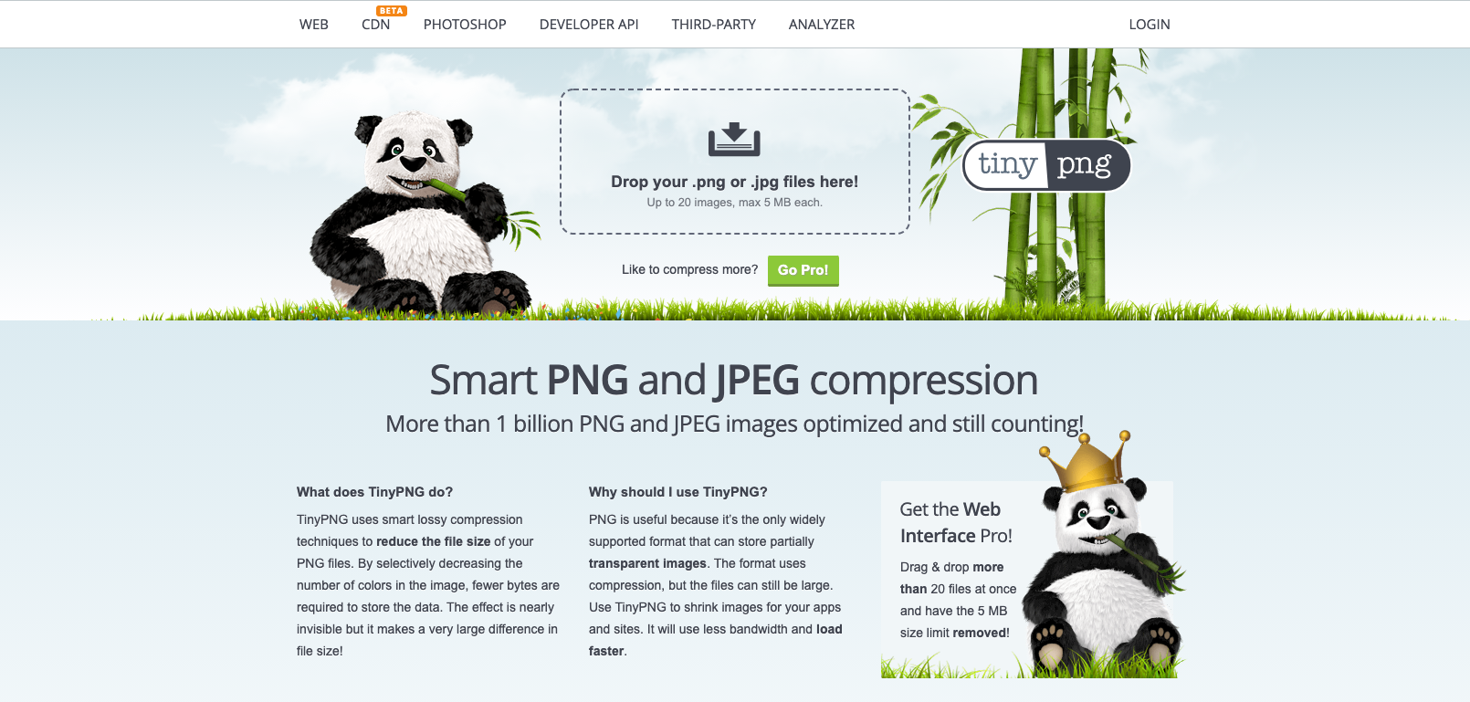
Remember how Google does not like an unfriendly Mobile view? Well, this is also enhanced by a Mobile page that takes too long to load. If your images are a large size, your page is going to take much longer to load and really hurt your SEO. Compressing the file size does not hurt the image but rather gives your page an instant boost so double check to make sure that your images are an appropriate size. Limiting overall content can be hard but will really help your website’s performance so get rid of any extra images and decrease pages if you can! Check out this website for easy file compression.
Check your fonts
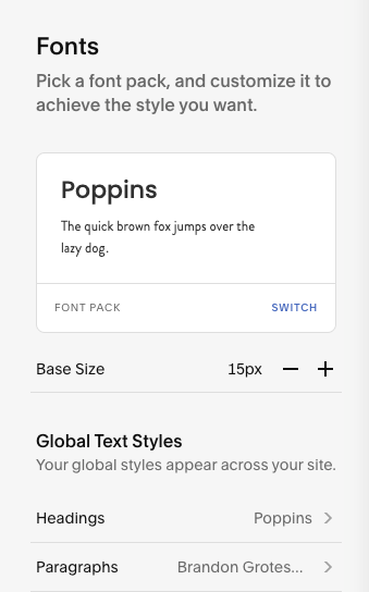
If your font size is set to 0px or lower on your standard website view, it could really mess up the font sizing on your mobile site. The text has the tendency to overlap if you are not super careful with font sizing. To double-check yours, click on mobile in your device view, and for version 7.1, in the Fonts panel, under Global Text Styles, click the font format you want to style. Ensure Letter Spacing is set to 0px or higher. In version 7.0 go to the Site Styles panel and make sure Letter Spacing is set to 0px or higher for all of your fonts.
There are so many different design techniques from self-coding to spacing that you can implement to make your website as mobile-friendly as possible and they are worth checking out if you have the time and noticed that a majority of your customers are finding you from your mobile site. These are just a few easy ones to implement today that will boost your site and overall SEO!